The goal of this analysis is to understand how dependency ratios in Washington State are evolving temporally and spatially. How are the statewide ratios evolving? Which counties have the highest ratios? Are there regional differences in dependency ratios? If so, are there any patterns to the distribution of high dependency ratios?
Statewide dependency ratios
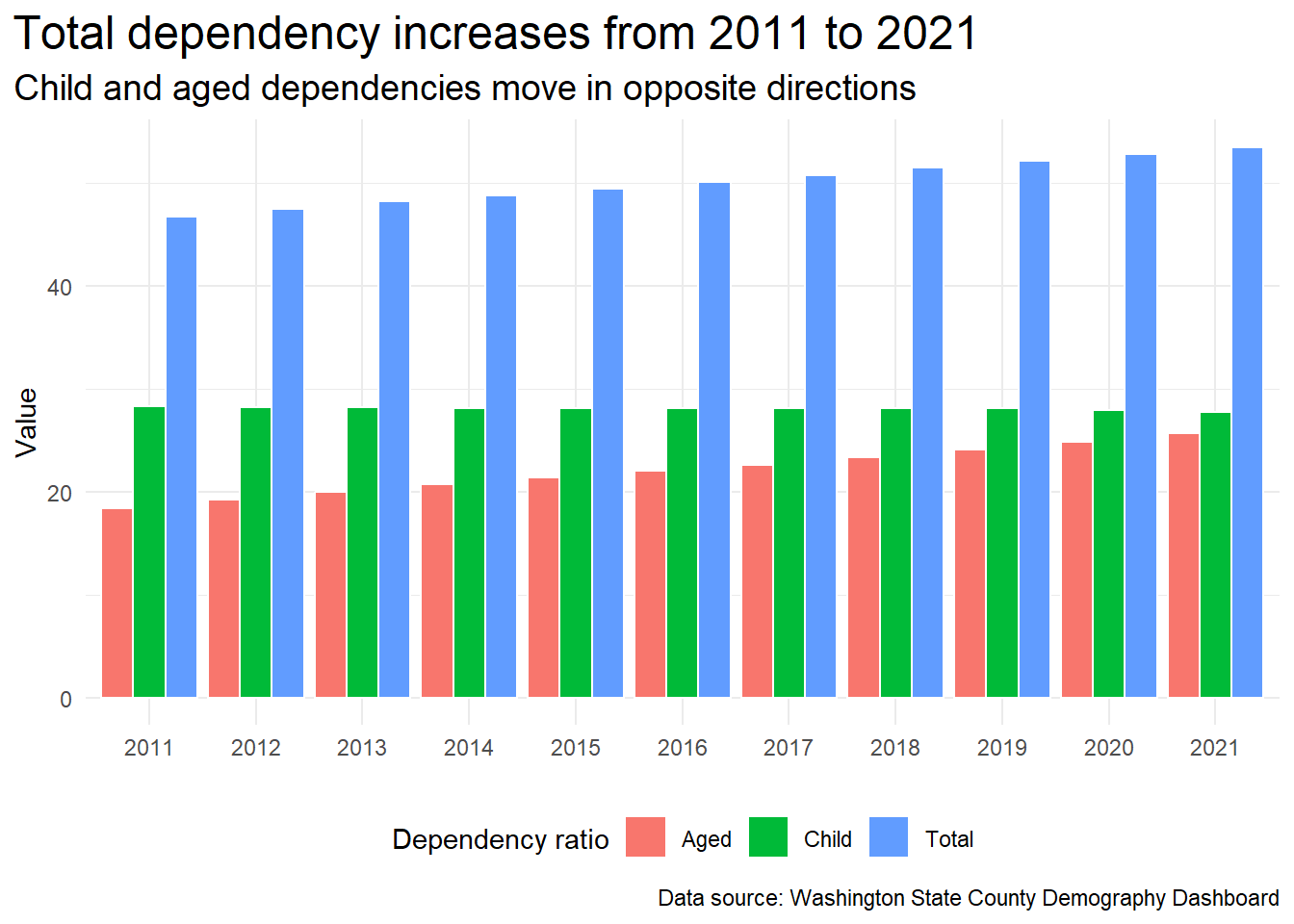
As the chart and table below show, the total dependency ratio for the State is increasing. Child and aged dependency ratios are moving in opposite directions. Child dependency is decreasing slowly while the aged dependency ratio is increasing. The aged dependency ratio is driving the trend in total dependency over the 10 years from 2011 to 2021.
Show the code
df_counties |>filter(geography =="Washington State") |>select(-(age_65:age_1)) |>pivot_longer(total_dep_ratio:aged_dep_ratio, names_to ="dep_ratio", values_to ="ratio_val") |>mutate(dep_ratio =fct_rev(fct_recode(as_factor(dep_ratio), "Total"="total_dep_ratio","Child"="child_dep_ratio","Aged"="aged_dep_ratio")) ) |>ggplot(aes(x=year, y=ratio_val, fill=dep_ratio)) +geom_col(position ="dodge", colour="white") +labs(x =element_blank(),y ="Value",fill ="Dependency ratio",caption="Data source: Washington State County Demography Dashboard",title =paste("Total dependency increases from", start_year, "to", last_year),subtitle ="Child and aged dependencies move in opposite directions" ) +theme(legend.position ="bottom" )
Changes in dependency ratios in Washington State, 2011 - 2021
Year
Child
Aged
Total
Percent Change Total
2011
28.29
18.40
46.69
NA
2012
28.22
19.22
47.44
1.61
2013
28.17
20.01
48.18
1.56
2014
28.11
20.69
48.81
1.31
2015
28.07
21.38
49.45
1.31
2016
28.08
21.99
50.06
1.23
2017
28.14
22.62
50.76
1.40
2018
28.15
23.37
51.52
1.50
2019
28.07
24.09
52.16
1.24
2020
27.94
24.86
52.80
1.23
2021
27.73
25.71
53.45
1.23
Understanding the total dependency ratio trend
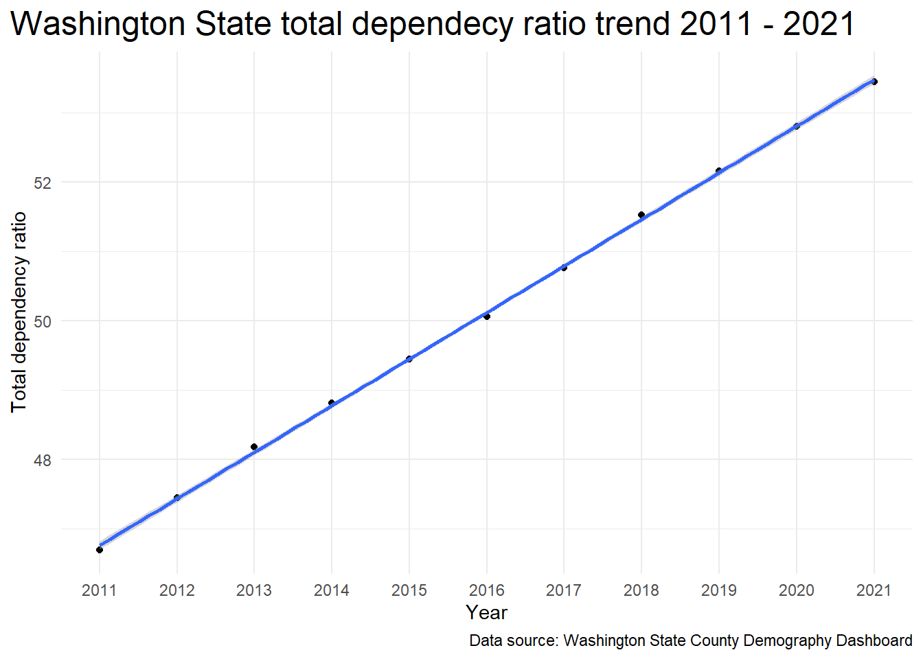
In order to quantify how total dependency is changing in Washington a simple linear model was employed. The model indicates that in each subsequent year the total dependency ratio increases by about 0.67 and the intercept can be interpreted as the value of the total dependency ratio in 2010.
Show the code
lm_fit <- df_counties |>filter(geography =="Washington State") |>mutate(year =as.numeric(year) ) |>lm(total_dep_ratio ~ year, data = _)model_estimates <- broom::tidy(lm_fit)model_estimates |>gt() |>tab_header(title ="Simple linear model of total depency ratio" ) |>fmt_number(decimals =2 )
Simple linear model of total depency ratio
term
estimate
std.error
statistic
p.value
(Intercept)
46.09
0.03
1,468.50
0.00
year
0.67
0.00
145.20
0.00
The plot below shows the model fit and confidence interval.
Show the code
df_counties |>filter(geography =="Washington State") |>ggplot(aes(x=as.numeric(year), y=total_dep_ratio)) +geom_point() +geom_smooth(method="lm", se=TRUE) +scale_x_continuous(breaks =1:11,minor_breaks =NULL,labels =as.character(2011:2021) ) +labs(title =paste("Washington State total dependecy ratio trend",start_year,"-",last_year),x ="Year",y ="Total dependency ratio",caption="Data source: Washington State County Demography Dashboard" )
The confidence interval is very tight around the trend line.
Prediciting future total dependency ratios
We can project this model forward a few years to see what total dependency ratios will be in subsequent years. When the 2022-23 demographic data become available, they can be compared with model predictions and the model can be updated.
Show the code
# 2022 and 2023 are the 12th and 13th years in the series.TDR_preds <-predict(lm_fit, newdata =data.frame(year =c(12,13)), type="response")
In this case, the model predicts total dependency ratios of 54.15 and 54.82 for 2022 and 2023, respectively.
Counties with highest total dependency ratios
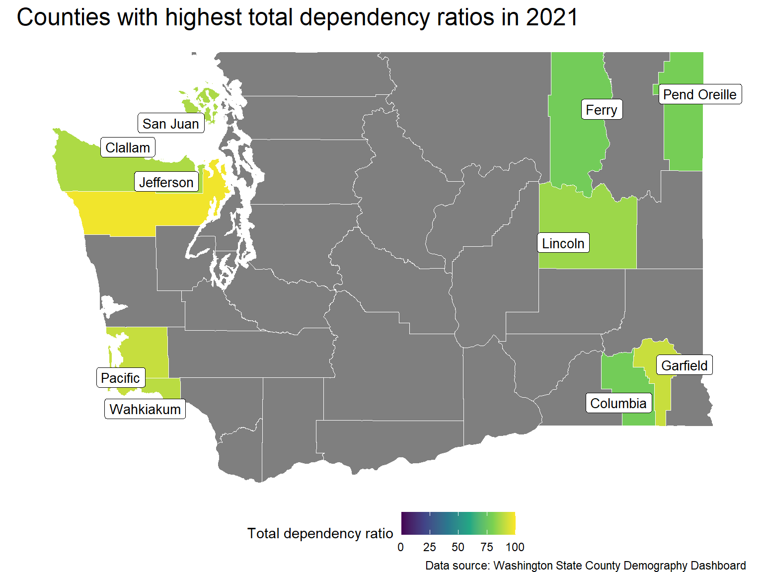
The table below shows the counties with the highest total dependency ratios in 2021. The counties in this list all have much higher aged dependency ratios than the statewide value (25.71) while generally having typical child dependency ratios. Jefferson county being the notable exception with a child dependency ratio of 18.58.
In order to understand how dependency ratios vary across the state, shape files for the counties are imported and the dependency ratios are overlaid on a map of the state.
Show the code
wa_county <-counties(state ="WA", cb =TRUE, class ="sf", progress_bar =FALSE)label_size <-3.5wa_county |>left_join(df_high_ratio, by=c("NAME"="County")) |>mutate(NAME =if_else(is.na(Total), "", NAME) ) |>ggplot() +geom_sf(aes(fill=Total), colour="white", ) +geom_label_repel(aes(label = NAME, geometry = geometry),stat ="sf_coordinates", size = label_size) +# for the same colour scale for all dependency maps with limitsscale_fill_continuous(type ="viridis",limits=c(0, 100)) + map_theme +labs(title="Counties with highest total dependency ratios in 2021",caption="Data source: Washington State County Demography Dashboard",fill="Total dependency ratio" )
From this map, it is clear that the distribution of the high dependency counties is not random. They are located on the east/west extremes of the state. Furthermore, 5 of the top 6 are located on the west coast, while the other five are located in the eastern quarter of the state.
Child dependency comparisons
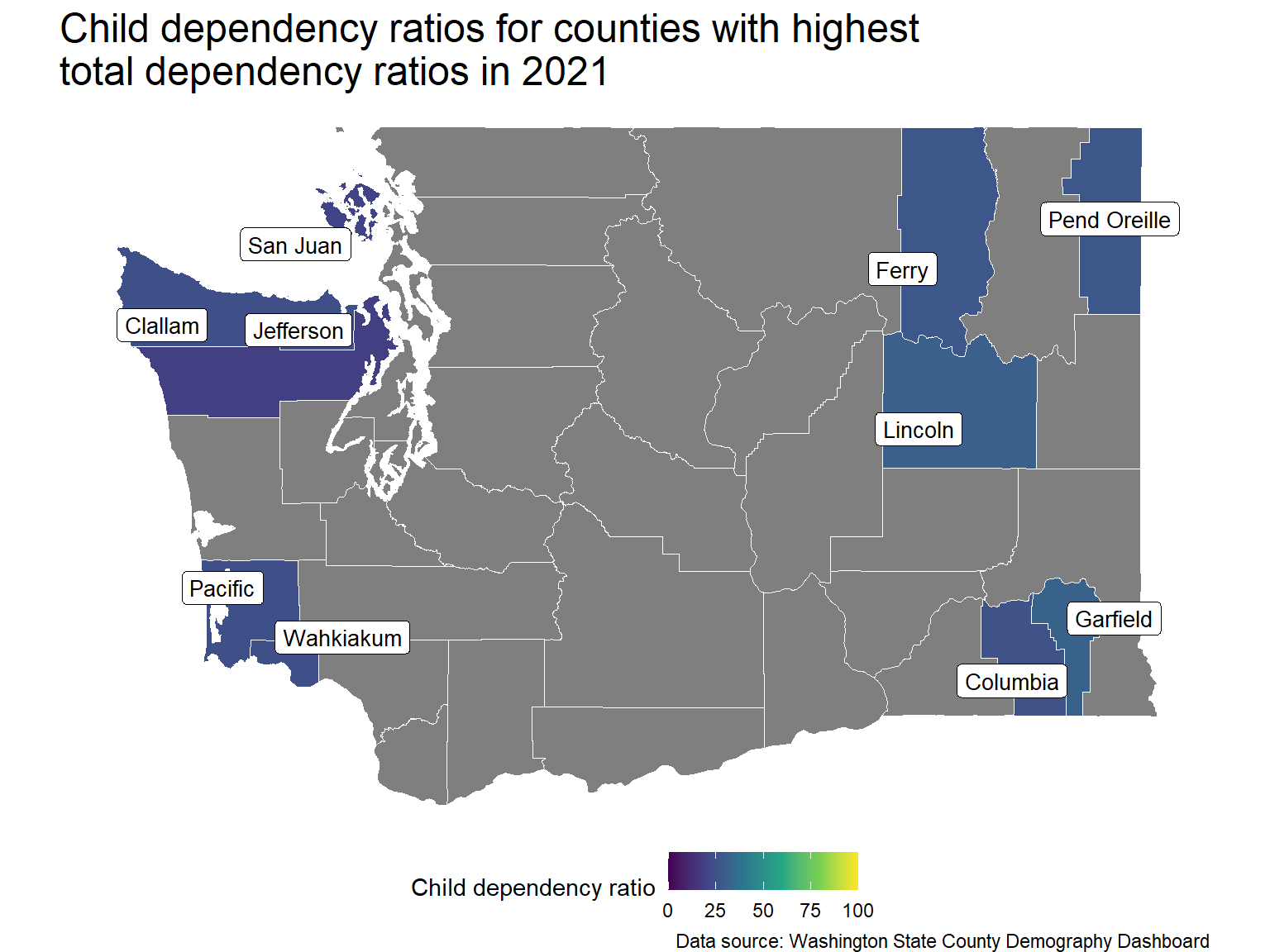
These counties have roughly similar rates of child dependency, with Jefferson and San Juan Counties being notable exceptions.
Show the code
wa_county |>left_join(df_high_ratio, by=c("NAME"="County")) |>mutate(NAME =if_else(is.na(Child), "", NAME) ) |>ggplot() +geom_sf(aes(fill=Child), colour="white", ) +geom_label_repel(aes(label = NAME, geometry = geometry),stat ="sf_coordinates", size = label_size) +# for the same colour scale for all dependency maps with limitsscale_fill_continuous(type ="viridis",limits=c(0, 100)) + map_theme +labs(title="Child dependency ratios for counties with highest\ntotal dependency ratios in 2021",caption="Data source: Washington State County Demography Dashboard",fill="Child dependency ratio" )
That said, there is a statistically significant difference, with \(\alpha=0.05\), between the mean child dependency ratios of the west coast and eastern counties.
    Welch Two Sample t-test

data:  west_coast_CDR and eastern_CDR
t = -3.5038, df = 7.9094, p-value = 0.00818
alternative hypothesis: true difference in means is not equal to 0
95 percent confidence interval:
 -10.016492  -2.055508
sample estimates:
mean of x mean of y
   22.392    28.428
If we compare the west coast counties to the statewide mean, there is a statistically significant difference at the \(\alpha=0.05\) significance level.
Show the code
t.test(x=west_coast_CDR,mu = state_CDR_mean)
    One Sample t-test

data:  west_coast_CDR
t = -4.1649, df = 4, p-value = 0.01409
alternative hypothesis: true mean is not equal to 27.73
95 percent confidence interval:
 18.83351 25.95049
sample estimates:
mean of x
   22.392
If we compare the eastern counties to the statewide mean, we can see that there is not a statistically significant difference at the \(\alpha=0.05\) significance level.
Show the code
t.test(x=eastern_CDR,mu = state_CDR_mean)
    One Sample t-test

data:  eastern_CDR
t = 0.60638, df = 4, p-value = 0.577
alternative hypothesis: true mean is not equal to 27.73
95 percent confidence interval:
 25.23205 31.62395
sample estimates:
mean of x
   28.428
Aged dependency comparisons
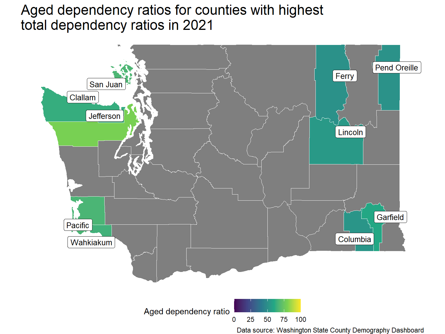
The map shows aged dependency ratios for these counties. It is clear that the west coast counties have higher ratios than the eastern counties.
Show the code
wa_county |>left_join(df_high_ratio, by=c("NAME"="County")) |>mutate(NAME =if_else(is.na(Aged), "", NAME) ) |>ggplot() +geom_sf(aes(fill=Aged), colour="white", ) +geom_label_repel(aes(label = NAME, geometry = geometry),stat ="sf_coordinates", size = label_size) +# for the same colour scale for all dependency maps with limitsscale_fill_continuous(type ="viridis",limits=c(0, 100)) + map_theme +labs(title="Aged dependency ratios for counties with highest\ntotal dependency ratios in 2021",caption="Data source: Washington State County Demography Dashboard",fill="Aged dependency ratio" )
With \(\alpha = 0.05\), there is a statistically significant difference between the means of the two regions’ counties.
    Welch Two Sample t-test

data:  c(79.39, 66.51, 64.54, 62.54, 67.15) and c(59.65, 53.93, 51.14, 52.23, 50.42)
t = 4.2993, df = 6.2829, p-value = 0.004584
alternative hypothesis: true difference in means is not equal to 0
95 percent confidence interval:
  6.359444 22.744556
sample estimates:
mean of x mean of y
   68.026    53.474
The aged dependency ratios for both county groups is so much higher than the statewide mean that performing a statistical test is unnecessary.
Key takeaway
Among the counties with the highest total dependencies there are significant differences between these counties and the statewide value. Furthermore, there are differences between the regional subgroups in these 10 counties.
Modeling changes in total dependency
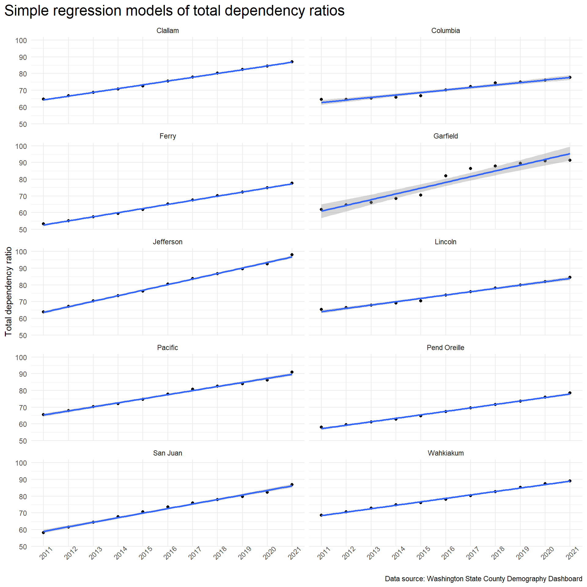
Predicting future changes to the total dependency ratio for counties can help county planners understand what budgetary pressures they might expect to face in the coming years. While attempting to forecast far into the future comes with risk, we can use simple linear models to project into the near future for the counties with the highest total dependency ratios.
The trend lines for all 10 counties show a clear upward movement.
The following table shows the model slopes for each of the ten counties. The interpretation of these slopes is that for each year the total dependency ratio will change by the amount of the slope. For Jefferson County, the state with the highest total dependency ratio, we can expect the total dependency ratio to change by 3.31 points each year. This almost 5 times higher than Washington State’s model slope of 0.67. Garfield County has the steepest slope, but as discussed below, the integrity of the Garfield County data is in question. The standard error for the Garfield County slope reflects this.
Show the code
df_county_models |>select(-data) |>unnest(model) |>select(-statistic) |>pivot_wider(names_from = term, values_from = estimate) |>rename(Intercept ="(Intercept)", "Slope"=year) |>filter(is.na(Intercept)) |>select(-Intercept, County ="geography", Slope, "Std Error"="std.error", "P Value"="p.value") |>relocate(Slope, .before ="Std Error") |>arrange(desc(Slope)) |>ungroup() |>gt() |>tab_header(title ="Rates of change for total dependency ratio by county" ) |>fmt_number(decimals =2 ) |>cols_align(align ="left",columns = County )
Rates of change for total dependency ratio by county
County
Slope
Std Error
P Value
Garfield
3.44
0.31
0.00
Jefferson
3.31
0.06
0.00
San Juan
2.72
0.07
0.00
Ferry
2.46
0.04
0.00
Pacific
2.44
0.07
0.00
Clallam
2.26
0.03
0.00
Pend Oreille
2.07
0.05
0.00
Wahkiakum
2.06
0.04
0.00
Lincoln
1.99
0.07
0.00
Columbia
1.49
0.11
0.00
Potential problems with Garfield County data
The Garfield County data has an interesting bend in it that occurred in 2016. This behaviour isn’t seen in the other counties. The Garfield County data for 2015-2016 shows the following:
Show the code
df_counties |>filter(geography =="Garfield"& year %in%c(2015,2016)) |>select(-(age_65:age_1)) |>select("Child"=child_dep_ratio, "Aged"=aged_dep_ratio, "Total"=total_dep_ratio) |>gt() |>tab_header(title =paste("Garfield County dependency data, 2015-2016") ) |>tab_options(table.width =pct(100) )
Garfield County dependency data, 2015-2016
Child
Aged
Total
25.72
44.72
70.43
30.44
51.62
82.06
There is a noticeable jump in both the child and aged dependency rates from 2015 to 2016. There is not a significant change in the total population of the county over the decade from 2011 to 2021 as shown in the following table: