Ecological Fallacy
The ecological fallacy arises when we make generalizations based on the aggregate statistics of an area, not recognizing that there can be quite a variation in the numbers at specific places within the area of interest. For example, while the overall rate of burglaries in the area might be 150/year, those burglaries are likely concentrated in a few places. Location matters! Drawing conclusions from aggregate data may lead decision makers to allocate scare resources inappropriately. This is why being aware of and understanding the ecological fallacy is important. When creating visualisations, it is important to ensure that the audience doesn’t fall prey to this fallacy.
The following visualisations demonstrate the fallacy and ways to avoid it.
Burglaries of businesses in Denver neighborhoods
To begin, we need to import neighborhood boundary data. The data are stored in a geojson geometry file and the coordinate reference system is WGS 84. Since we will need to use a projection coordinate system to compute densities, we will transform the neighborhood boundary data to EPSG:2232, which is also called the NAD83/Colorado Central projected coordinate system. We will also generate the bounding box that contains all of the neighborhoods.
Now we need to get the burglary data. We are only interested in data from 2021 and we only want burglaries that occurred inside the bounding box. This will eliminate burglaries that don’t have coordinate information or that have bad coordinates. Once we have filtered down to the data we want, we will transform the coordinate system to NAD83 so that the burglary data and neighborhood boundaries are using the same coordinate reference system. Once this is done, we will count the burglaries that occur in each neighborhood by joining the burglary data to the neighborhood data.
Code
# We are only looking at 2021 data
df_burglary_biz_2021_sf <- df_burglary_biz |>
  filter(c_year == 2021 &
         between(geo_x, bbox["xmin"], bbox["xmax"]) &
         between(geo_y, bbox["ymin"], bbox["ymax"])) |>
  st_as_sf(coords = c("geo_x", "geo_y"),
           crs = "EPSG:2232")

df_burglary_biz_cnts_by_nbhd  <- df_burglary_biz_2021_sf |>
  select(neighborhood_id, geometry) |>
  st_join(nbhds) |>
  st_drop_geometry() |>
  select(nbhd_name) |>
  count(nbhd_name, name="offenses")
Now that we have counts for each neighborhood, we can create a choropleth map.
A choropleth map of buglaries in Denver neighborhoods
This interactive map shows the counts of business burglaries that occurred in each neighborhood in 2021. While this map does give some sense of how these crimes are distributed, it is misleading. For example, the Stapleton neighborhood has a large number of burglaries, the highest of any neighborhood, in fact. It also covers a much larger area than most of the neighborhoods in the city and so without making a correction, the numbers can be misleading. Ideally, we would have the number of businesses registered in each neighborhood. We could then calculate a number of different rates including the incidence, prevalence, and concentration of burglaries.
\[
\text{incidence} = \frac{\text{crimes}}{\text{population}} \\[1cm]
\text{prevalence} = \frac{\text{victims}}{\text{population}} \\[1cm]
\text{concentration} = \frac{\text{crimes}}{\text{victims}}
\] The incidence rate is very useful for comparing different areas. In our case, the population consists of businesses with a physical address and the crimes are individual burglaries.
The prevalence rate tells us the average risk of a business being the victim of a burglary.
The concentration rate tells us how crimes distributed among the victims. A number greater than 1 indicates that at least some businesses are victimized more than once.
Code
df_nbhd_burglary_biz <- nbhds |>
left_join(df_burglary_biz_cnts_by_nbhd, by="nbhd_name") |>
# any neighborhoods that have no crimes will have NA. Replace these with 0's.
replace_na(list(offenses = 0))
rm(df_burglary_biz_cnts_by_nbhd)
colours_red <- colorNumeric(palette = "Reds", domain = NULL)
df_nbhd_burglary_biz |>
st_transform("WGS84") |>
leaflet() |>
addProviderTiles("CartoDB.Voyager") |>
addPolygons(
fillColor = ~ colours_red(offenses),
fillOpacity = 0.50,
weight = 2,
color = "black",
popup = paste0(
"<b>Neighborhood:</b> ",
df_nbhd_burglary_biz$nbhd_name,
"<br/>",
"<b>Number of burglaries:</b> ",
df_nbhd_burglary_biz$offenses
),
label = df_nbhd_burglary_biz$nbhd_name,
labelOptions = labelOptions(
style = list(
"font-weight" = "normal",
padding = "3px 8px",
textsize = "15px",
direction = "auto")
),
highlightOptions = highlightOptions(
weight = 5,
color = "#666",
fillOpacity = 0.7
)
) |>
addLegend(
pal = colours_red,
values = ~ offenses,
title = htmltools::HTML("Number of burglaries<br />by neighborhood")
) |>
addMiniMap(toggleDisplay = TRUE)Createing a density map
Kernel density estimate
A kernel density estimate is an estimate of the probability distribution of the data that has been collected. In our case, the kernel density estimate represents the probability of burglaries occurring at any given place in two dimensions based on the available data. Areas where more crimes have occurred will have a higher probability associated with them.
To create a density map, we first have to create a kernel density estimate. The function hotspot_kde from the sfhotspot package will do this for us. The software will create a grid of cells based on the size of the area and how the crimes are distributed. We will clip the grid based on the neighborhood boundaries so that we don’t render grid cells outside the area for which we have data.
We can now use the densities computed by hotspot_kde to create a density map that shows how burglaries are distributed across the city.
Code
ggplot() +
  # Use openstreetmap for a background map.
  annotation_map_tile(type = "cartolight", zoomin = 0, progress = "none") +
  geom_sf(
    aes(fill = kde),
    data = df_burglary_biz_2021_kde,
    alpha = 0.75,
    colour = NA
  ) +
  scale_fill_distiller(
    palette = "YlOrBr",
    direction=1,
    breaks = range(pull(df_burglary_biz_2021_kde, kde)),
    labels = c("lower", "higher")
  ) +
  geom_sf(data=nbhds, colour="grey50", fill=NA) +
  annotation_scale(style="ticks", location="br", unit_category="imperial") +
  labs(
    title = "Density of burglaries of businesses in Denver in 2021",
    subtitle = "Burglaries are concentrated in the downtown area",
    caption = str_glue("Data source: Open Data Catalog",
                       "Background map by OpenStreetMap",
                       .sep = "\n")
  ) +
  theme_void() +
  theme(
    plot.title.position = "plot",
    plot.caption.position = "plot",
    plot.margin = unit(c(0,15,0,15), units = "pt"),
    plot.caption = element_text(colour = "grey40", hjust = 0),
    plot.subtitle = element_text(margin = margin(t = 6, b = 6), size = 12),
    plot.title = element_text(colour = "grey50", face = "bold", size = 16)
  )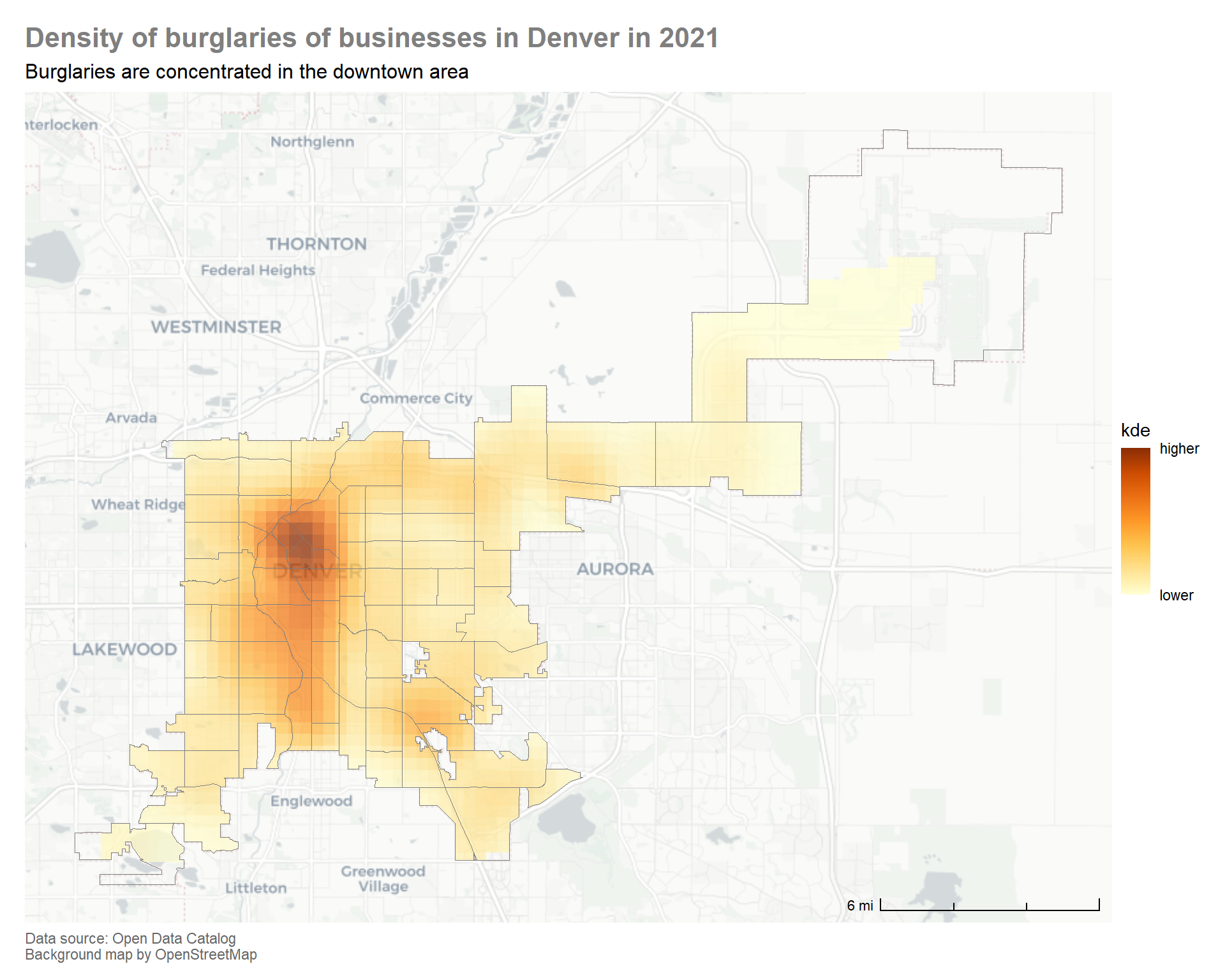
Compare this map to the choropleth map above. While there are some similarities, the density map shows much more nuance. In particular, we can see that the density of business burglaries in the Stapleton neighborhood is quite different to other neighborhoods that had a similar number of offenses. This helps to highlight the risk of the ecological fallacy that is inherent in choropleth maps. Choropleth maps can be very useful and sometimes, given the data available, they might be the only type of map that can be produced. It is important to keep their limitations in mind and communicate these to our audience.